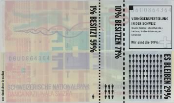
A friend of a friend pointed me to this very cool .pdf with instructions on how to print an infographic visualizing the distribution of wealth in Switzerland onto Swiss 10.- Franc banknotes, the Swiss version of OccupyGeorge.com.
As is turns out things are even more extreme in Switzerland than say in the USA or in Germany. While in the US 1 % of the population own 40% of the wealth, here in Switzerland this figure is 59%. Things get even more extreme when you look at the richest 10%, they own 71% of the wealth.
Any way you cut it, there is neither much left for the 99% nor the 90%.
These numbers are according to Hans Kippling’s Book “Reichtum ohne Leistung” as quoted here and here [german language articles].
Download the PDFs here:
Print-Instructions
Sample-Print
Feel free to spread the idea ;p


